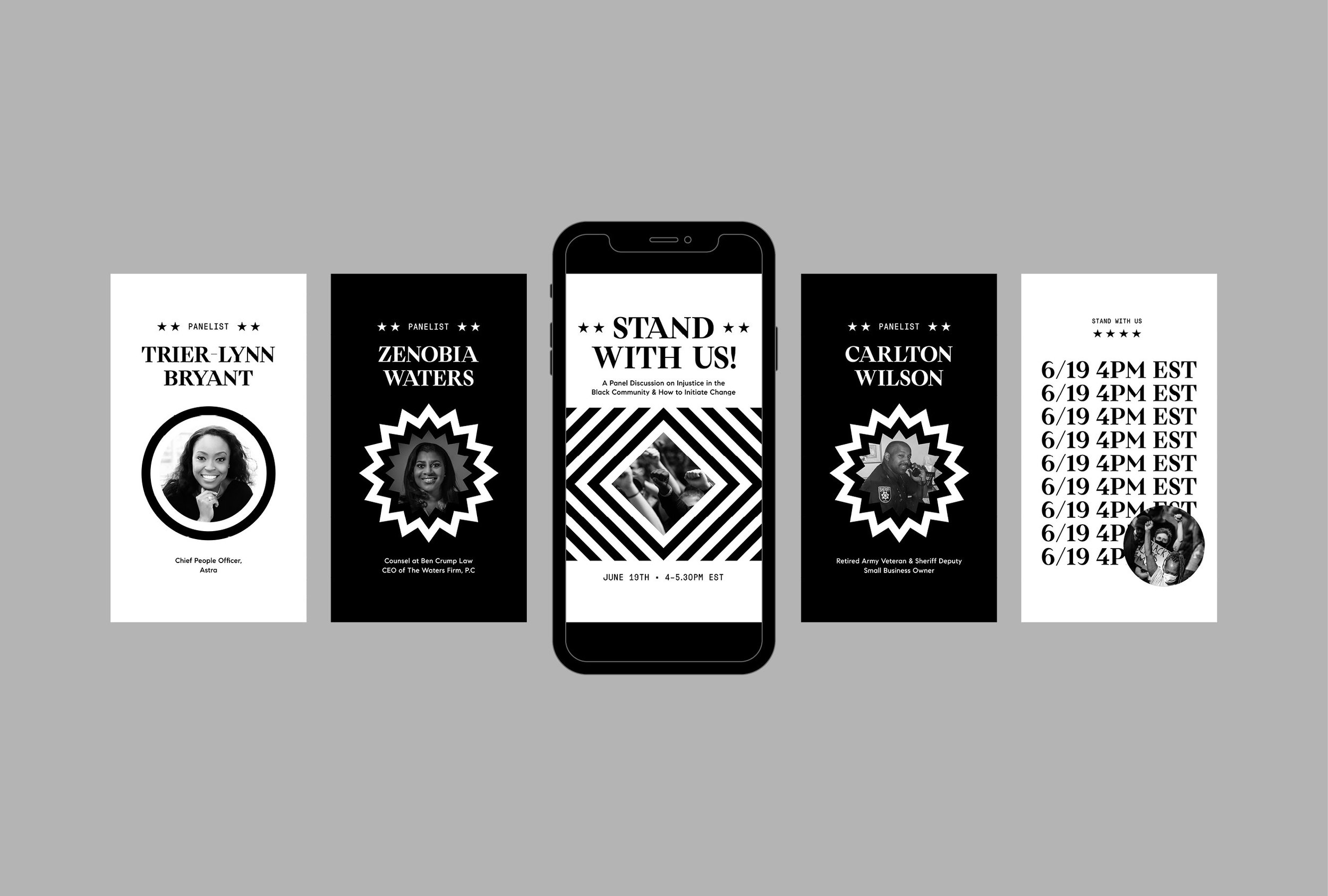
COMPASS GALLERY / PRINT & DIGITAL
In-House
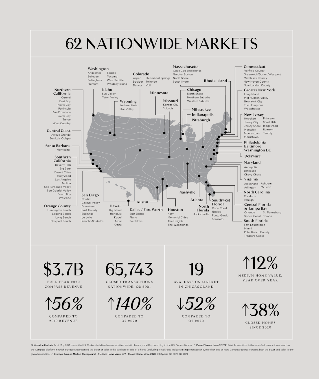
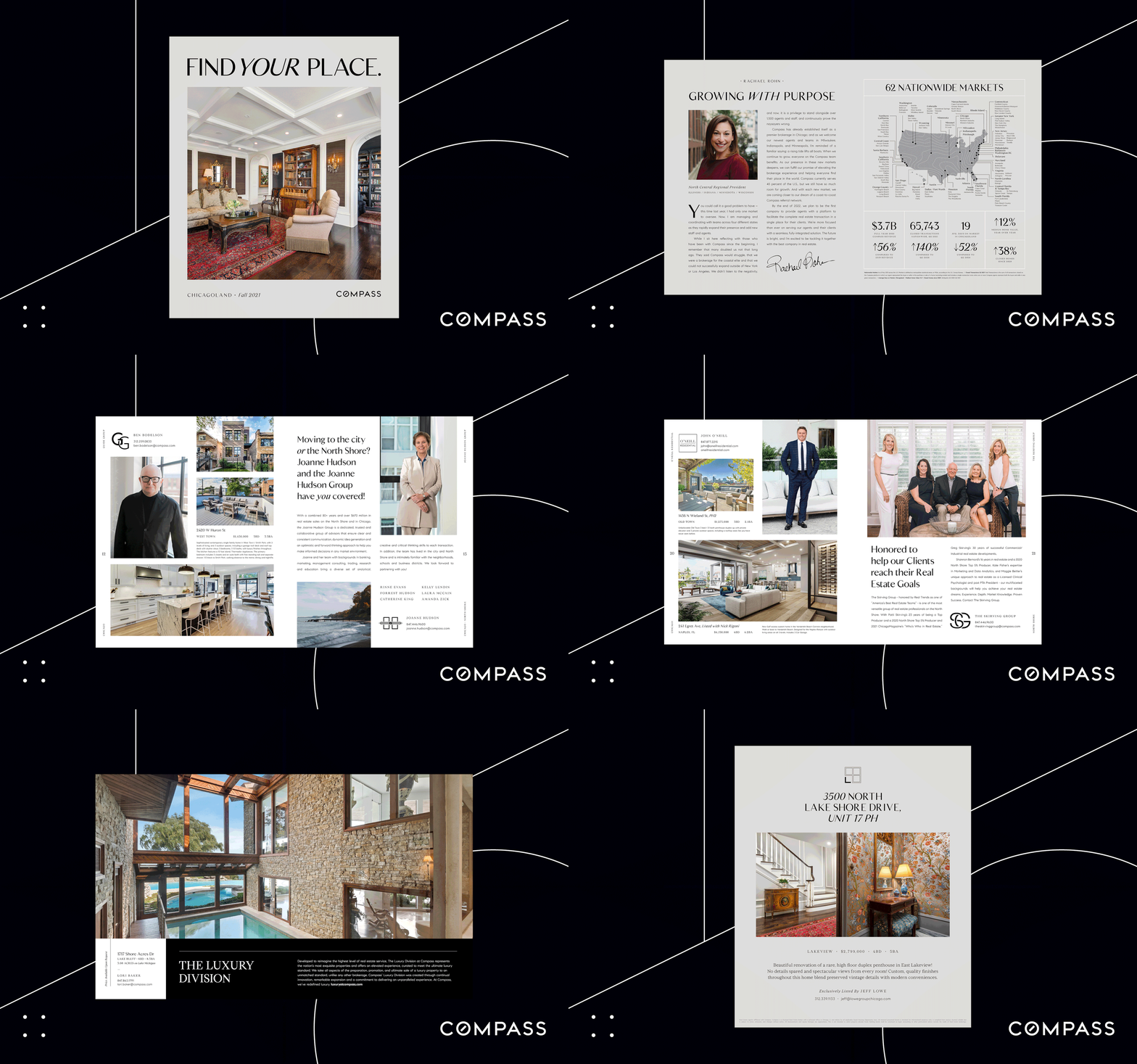
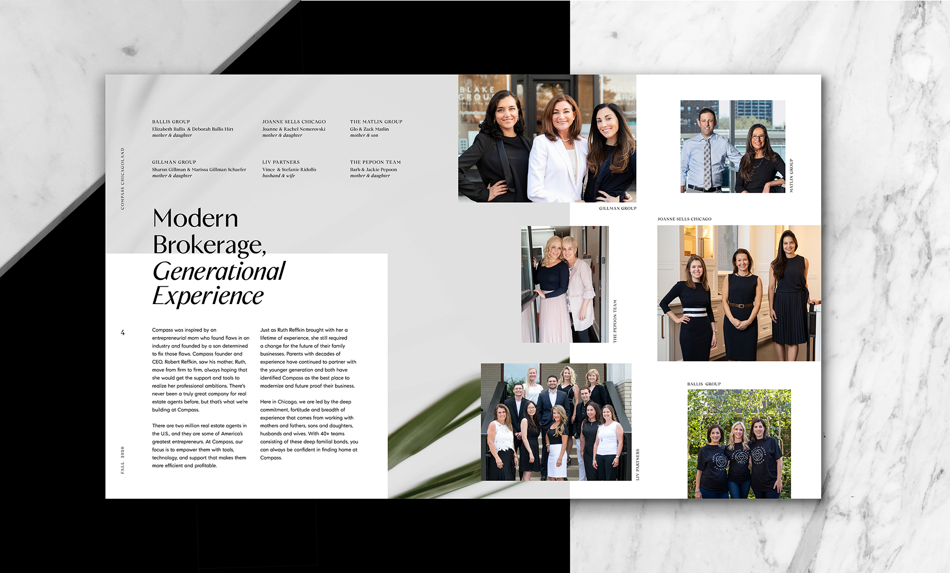
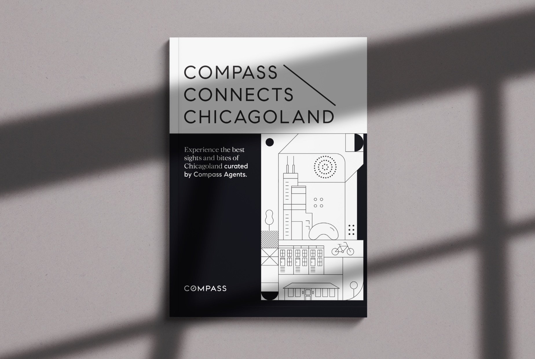
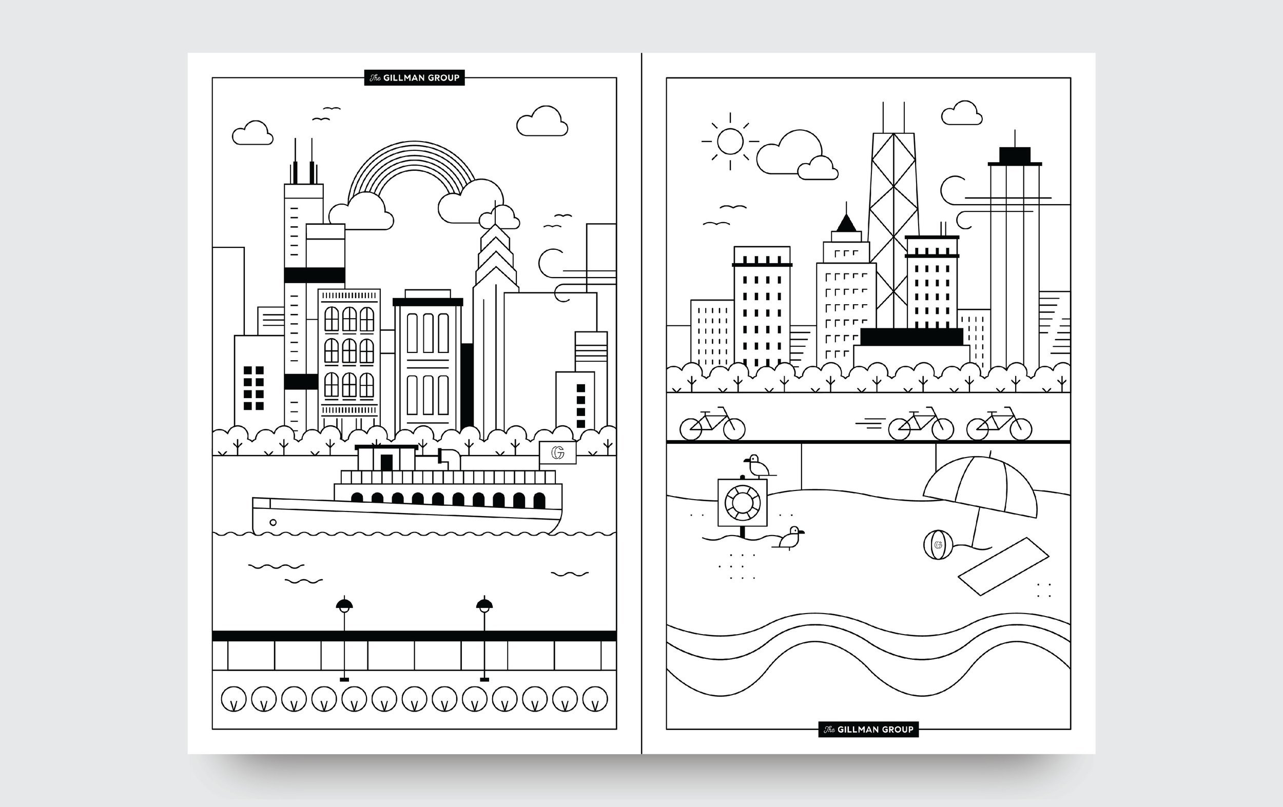
Compass is a prominent brand with a significant presence in various regions across the United States. As the first designer on the team during its launch in Chicago, I played a crucial role in establishing the regional brand identity in the greater Chicagoland area. On a larger scale, I have contributed to various projects, both big and small, across digital and print media, including the development of a unique font that has become part of the broader Compass brand identity.
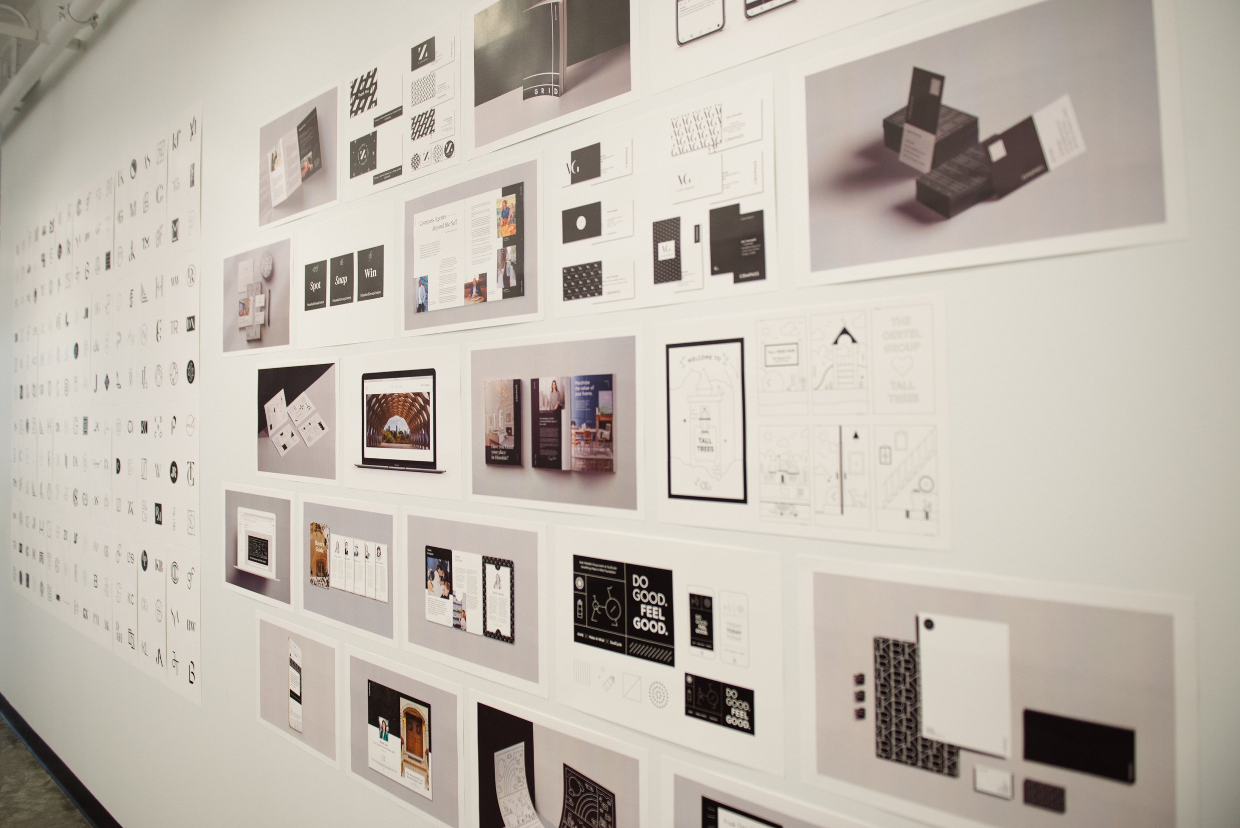


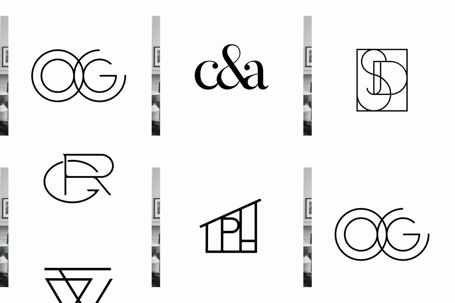
INTERNAL SUBBRAND IDENTITIES
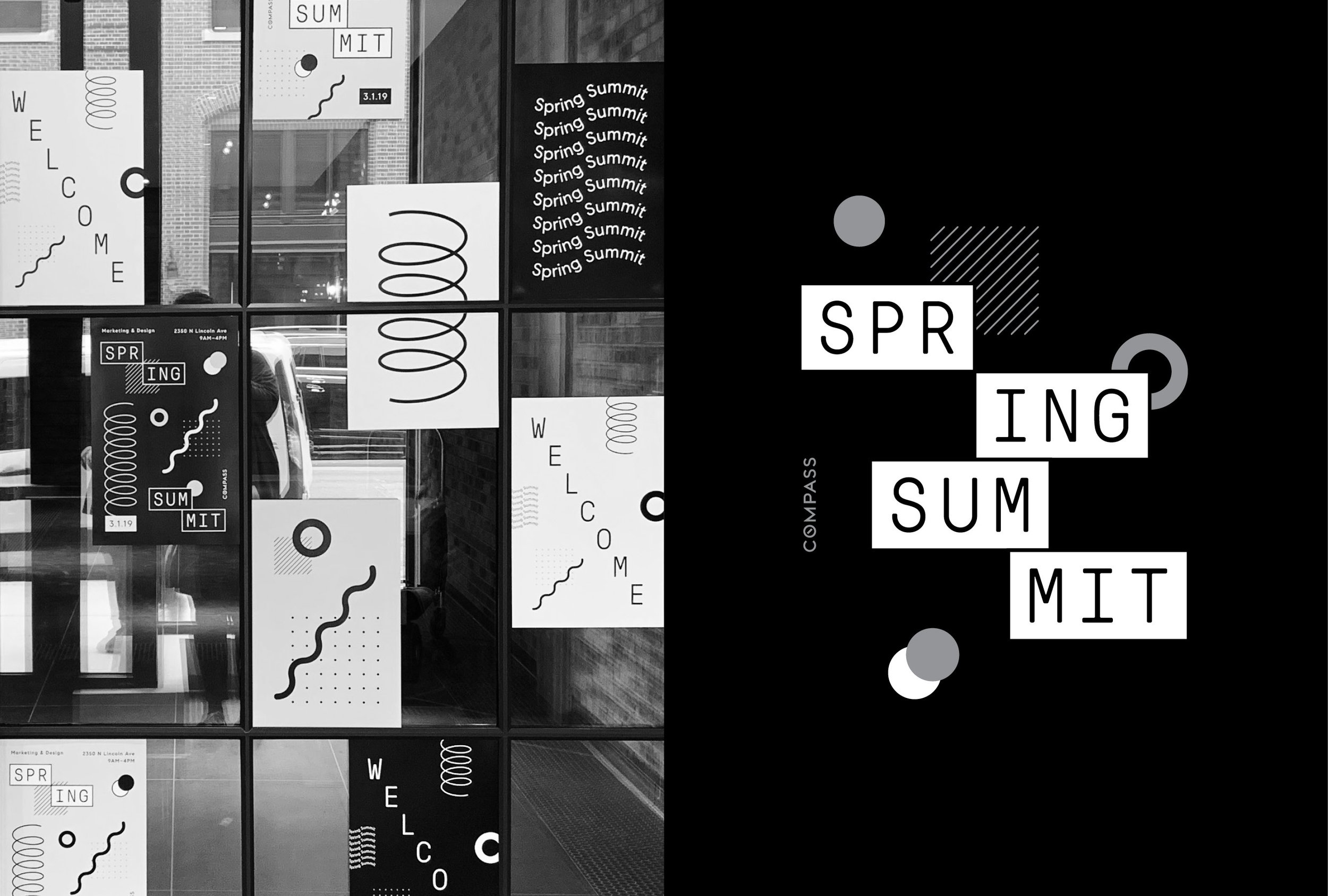
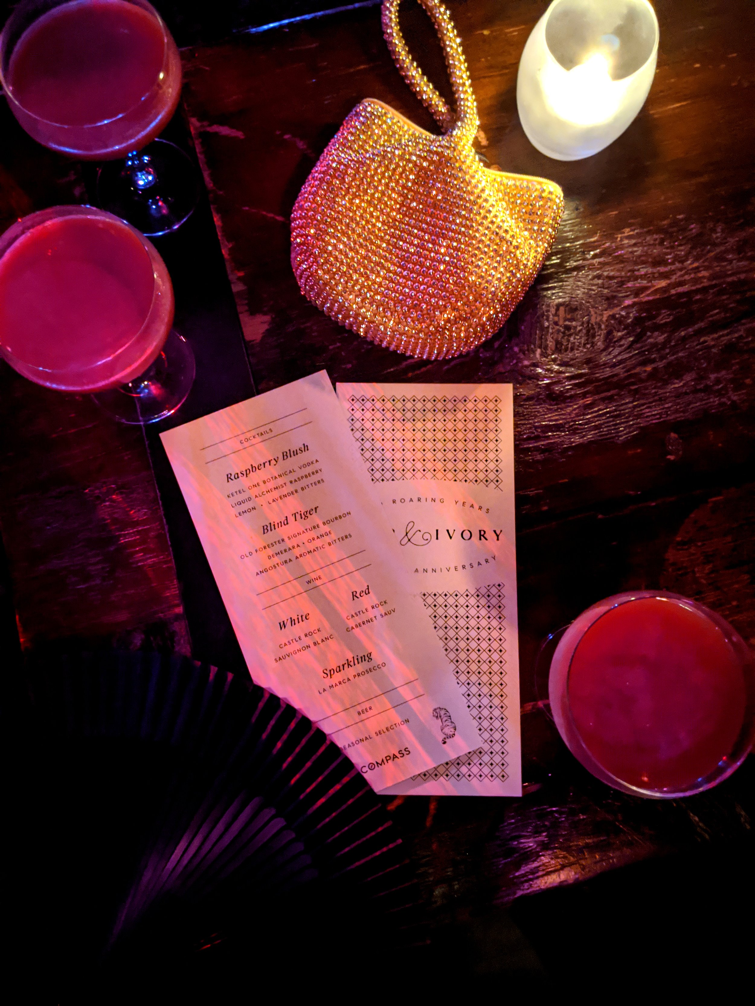
EVENT IDENTITIES


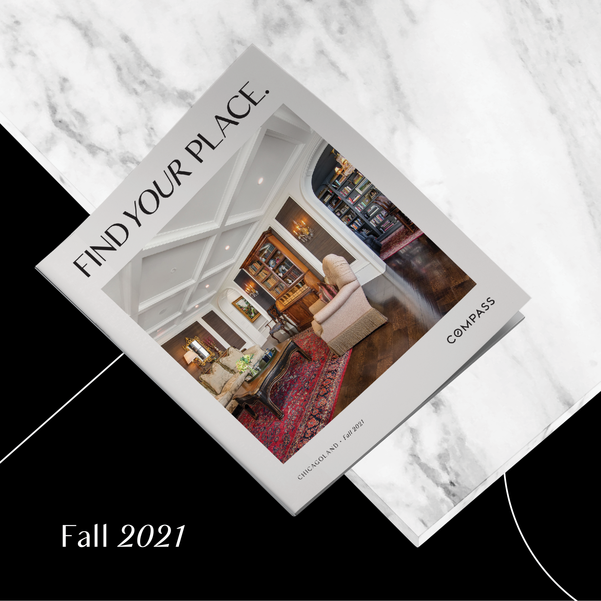
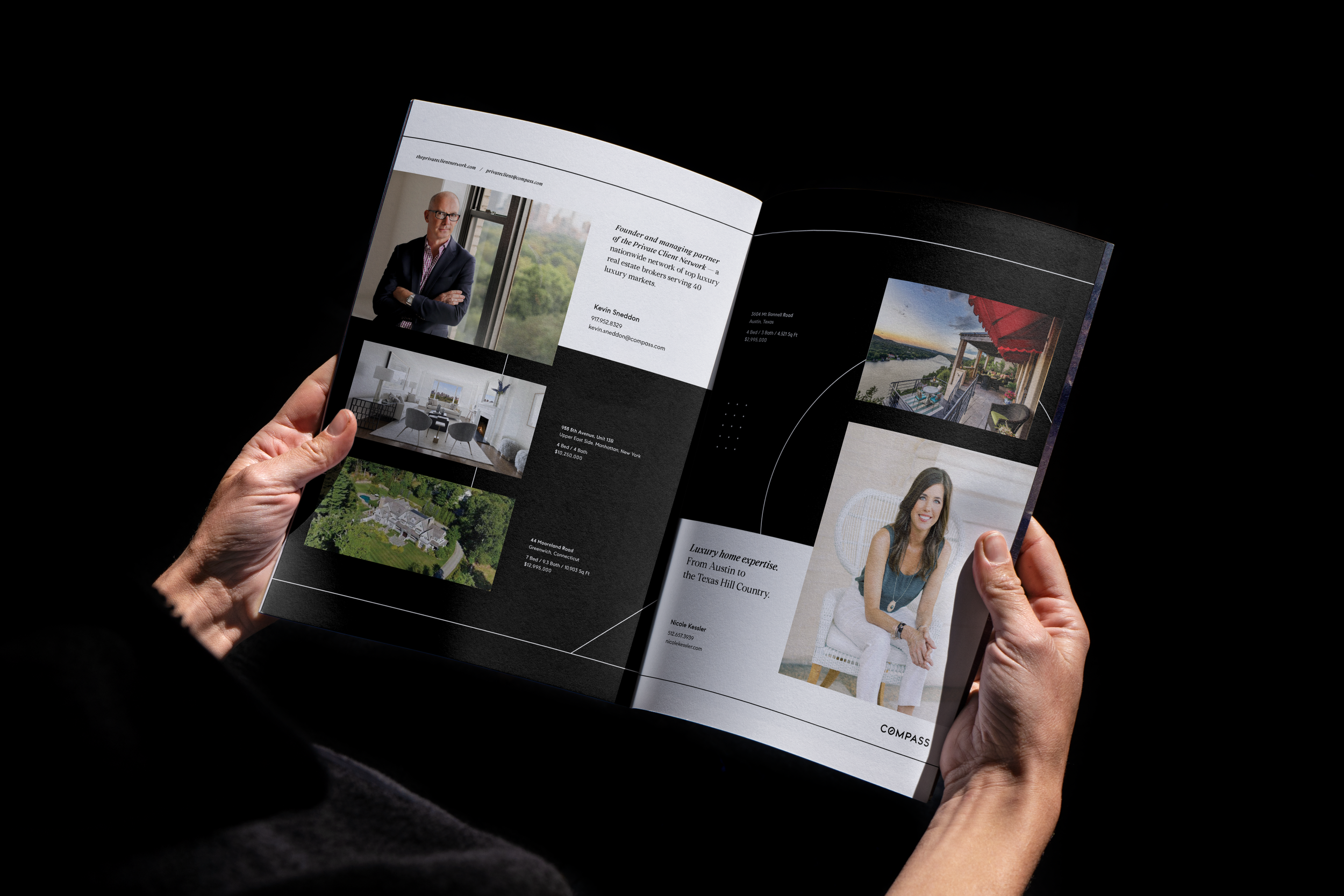
PRINT BOOKLETS & LARGE PUBLICATIONS

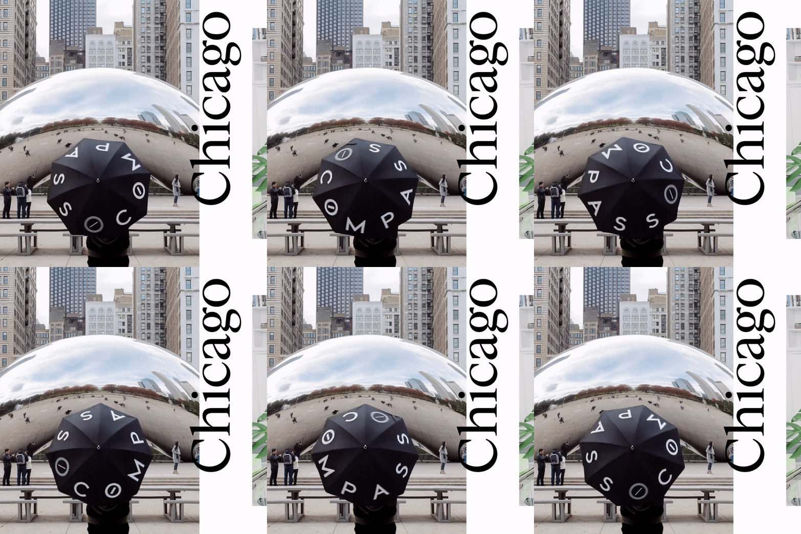
SOCIAL & DIGITAL GRAPHICS
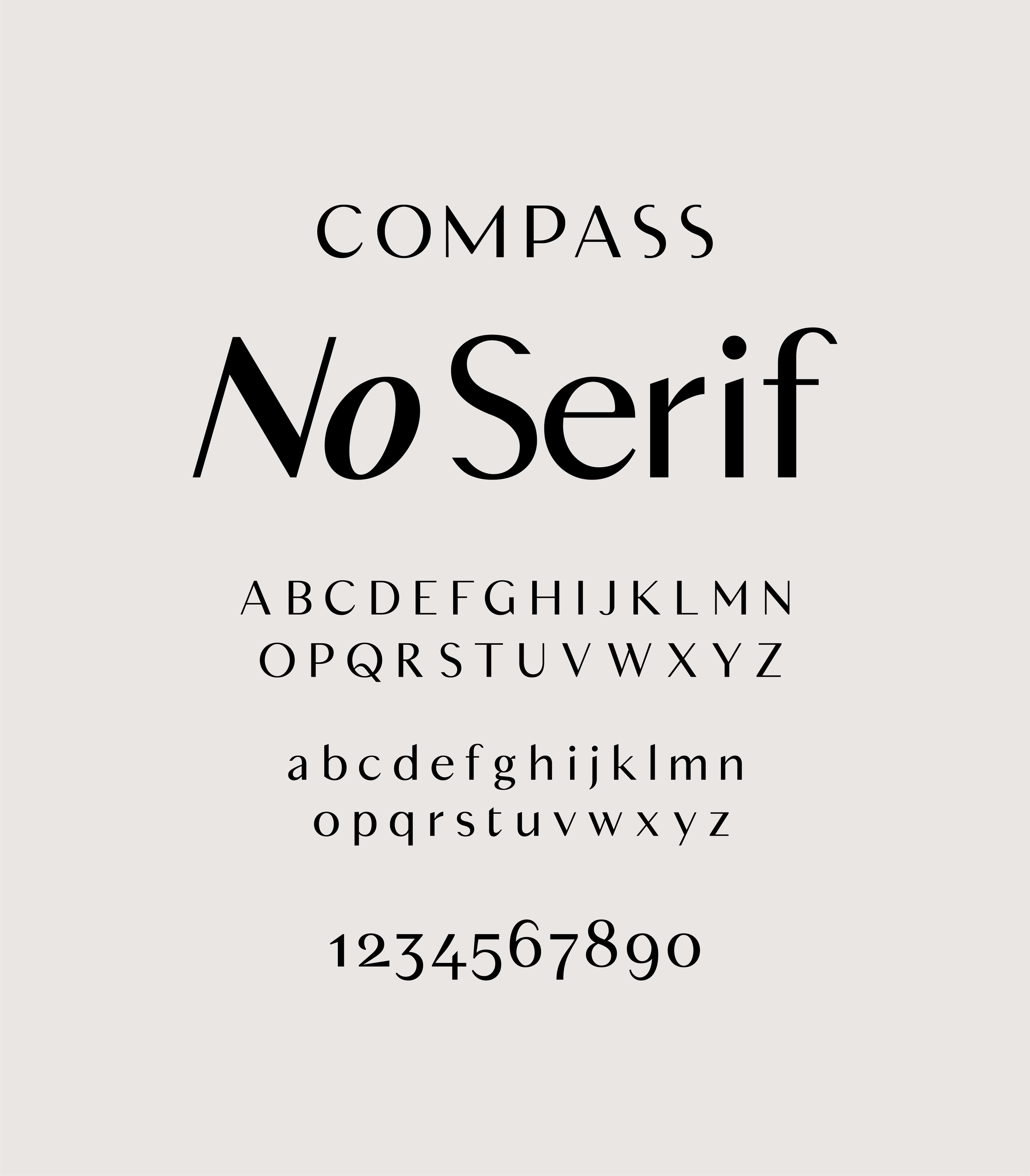
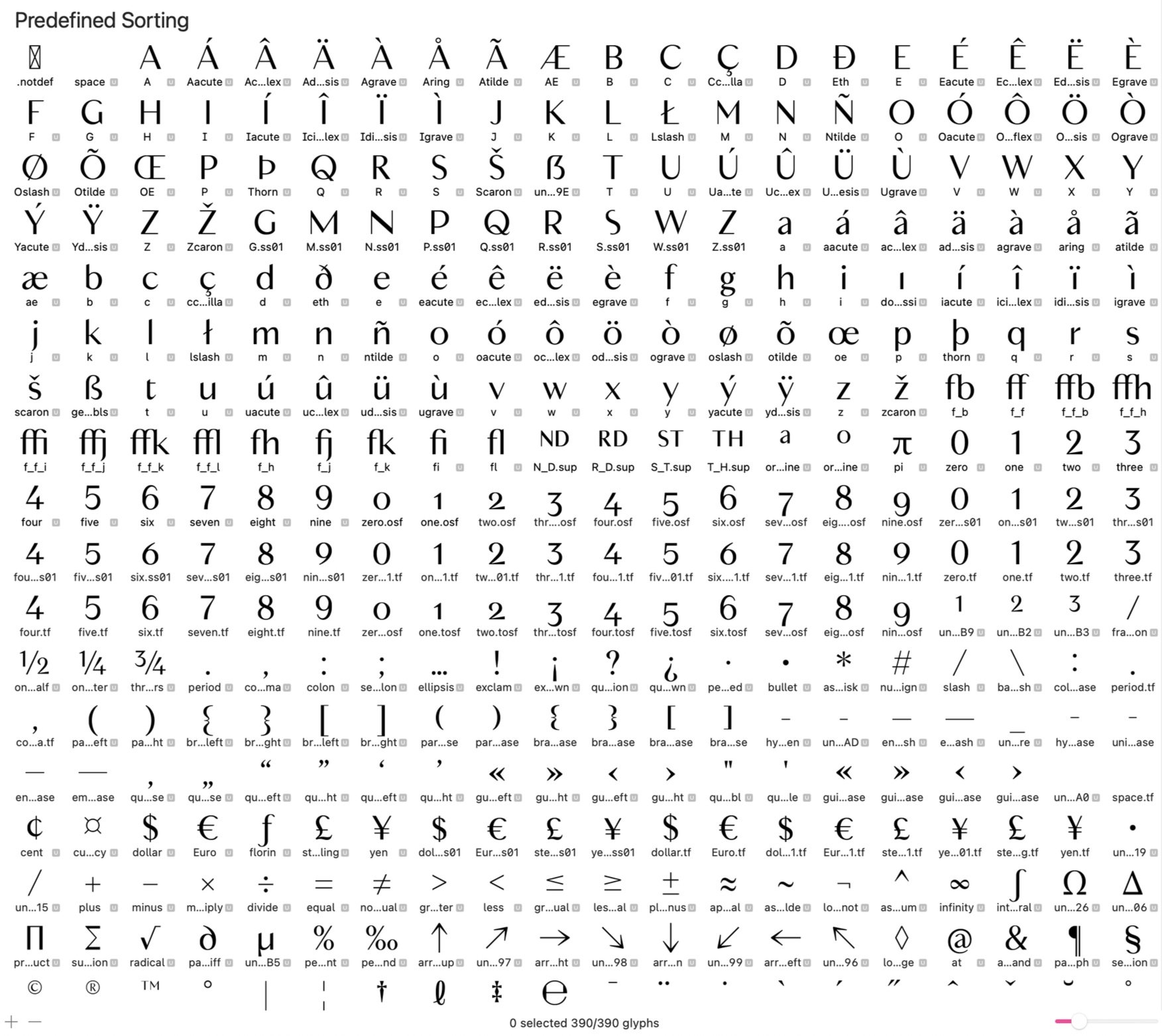
CUSTOM FONT / COMPASS DISPLAY
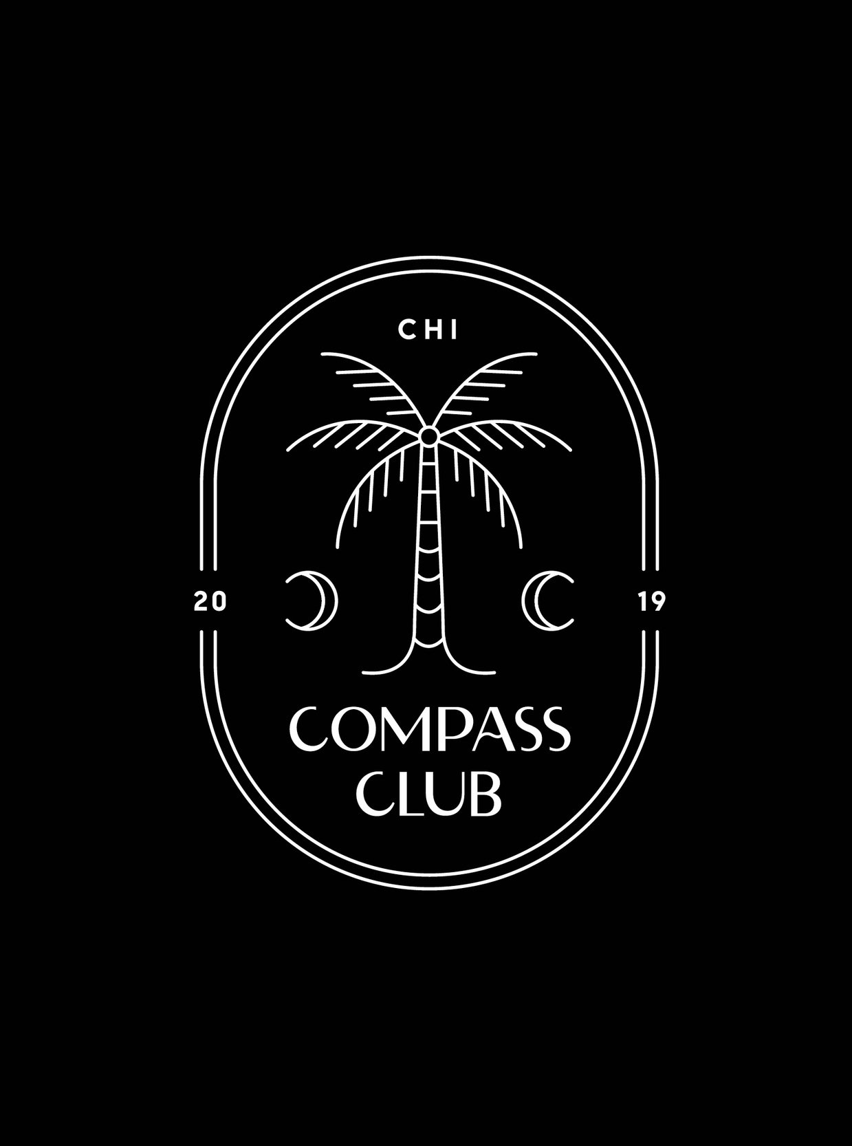
The Compass brand initially only used two distinct custom fonts - Compass Sans and Compass Serif. Now, a third, born out of a type exercise on font manipulation, and a simple concept; remove the serifs. The first iteration of this concept can be seen in the logotype for Compass Club, but it had it’s quirks. This led me to teach myself how to use Glyphs and properly edit from our current serif font to bring Compass “no-serif” to life. Today, known as Compass Display, this font is a fully functional typeface used throughout the brand, providing our agents with an additional style option for their marketing.
